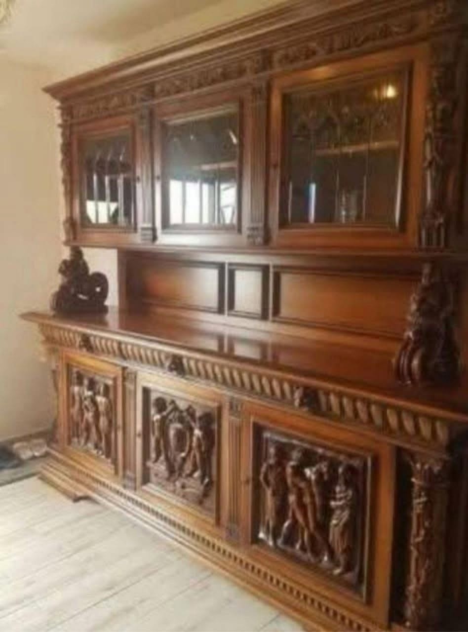
Every couple has that one home design project—the one that starts out completely innocent and somehow evolves into a playful, creative standoff. This interior design debate arrived the moment a solid wood, vintage dresser hutch with gorgeous lines and natural character was brought home. The second it was uncovered, a clear vision emerged: paint it red.
Not a loud or flashy shade, but a bold, deep, classic red. The kind of color that feels warm, confident, and timeless—a color that doesn’t shout but effortlessly owns the room. The husband’s immediate reaction? Total disbelief: “Red? No way.”
🎨 The Arguments
My Side of the Story: The Case for Crimson
Color has the power to completely transform a living space. A red dresser hutch isn’t just a piece of furniture; it is a deliberate design statement. When executed correctly, red can feel dramatic, cozy, elegant, and surprisingly sophisticated. Consider the diverse emotional spectrum of the palette:
-
Barn Red: Evokes a sense of rustic, farmhouse warmth.
-
Cherry Red: Channels a distinct, mid-century vintage charm.
-
Deep Crimson: Introduces unparalleled richness, luxury, and depth.
When paired with neutral walls and raw, natural textures, a painted hutch will not overpower the space—it anchors the room. It transitions a generic piece of furniture into a custom focal point that carries personal attitude. Painting the wood wouldn’t erase its natural lines; it would beautifully highlight them.
His Side of the Story: The Case for Timber
The counterargument stems from a deep appreciation for the raw materials. This perspective focuses entirely on the natural wood grain, the organic texture, and the visible history embedded within the original finish. To someone firmly in the “wood should stay wood” camp, painting over a vintage piece feels like covering up a rich story that took decades to tell. Raw, polished timber is classic, safe, and inherently timeless.
🤝 The Creative Compromises
Because successful interior decorating is about collaboration rather than winning an argument, the standoff has shifted into a negotiation phase. Several design compromises are currently on the table to satisfy both preferences:
-
The Peek-a-Boo Interior: Keep the exterior frame entirely raw, polished wood, but paint the interior shelves or the back panel red to offer a subtle, unexpected pop of color when the doors are opened.
-
The Two-Tone Split: Maintain the natural wood grain across the main structural frame while going bold by painting only the drawer fronts or cabinet doors crimson.
-
The Stained Red Hybrid: Utilize a translucent crimson wood stain or red antiquing wash rather than an opaque latex paint. This infuses the bold red hue into the piece while preserving the visible grain lines beneath.
-
The Discreet Test Patch: Apply a small sample of red paint to a tiny, hidden section (such as the back or inside a drawer) purely to study how the pigment reacts to the wood under room lighting.
💡 Design Conclusions:
LOOK NEXT PAGE DEAR──►